- blog/
weeknotes: week 10
Things I’ve gotten up to since my last weeknotes:
- continued the Esri Cartography MOOC
- started the Data Visualization Fundamentals and Best Practices from Observable
- tinkered with my website: playing with flex to tweak the layout
- tinkered with my website: created a shortcode for images that are drawings
- fixed the obsidian-remarkable plugin’s post-processing script
A few more words about each of those…
Esri Cartography MOOC: I have dabbled with ArcGIS for the first time. So far so good.
Observable – Data Visualization Fundamentals and Best Practices: I’ve encountered Observable in the past and always thought it looked pretty neat. A web-based / javascript-based Jupyter Notebook was my impression of it. So when I stumbled across this announcement from the course instructor I thought “oh cool an excuse to explore Observable!” and so here I am starting yet another course.
Tinkering with my website (Flex): I have some ideas for tweaking the layout of my homepage so I’ve been making sense of how CSS Flexbox works – this Interactive Guide to Flexbox from Josh Comeau has been quite helpful!
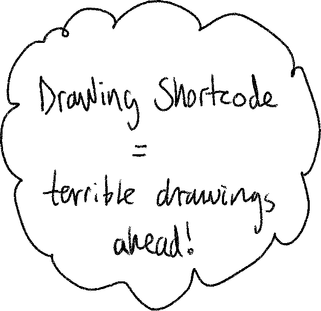
Tinkering with my website (Drawing Shortcode): I have a blog post in the pipeline that includes a drawing that I drew on my reMarkable tablet. I use the obsidian-remarkable plugin to screenshot my drawings into my notes. The post-processing script does 3 things:
- removes the menu and other interface elements
- crops the image to hug only the marks I put on the page
- makes the background transparent
The result is just like the demo gif from the plugin’s README. That’s fine for my notes, but I decided I’d like drawings included in blog posts to look more like my original drawing, i.e. black marks on a light background. However, as my blog currently exists in only a dark mode theme, the background is too dark for black marks. So I needed a way to add a light background to my drawing images. So I made a shortcode that sets a pale yellow background for any image inserted with it. This will only have any effect on images with transparent backgrounds, which my drawings do. I think it makes the drawings look sort of like they’re drawn on post-it notes :)

Obsidian reMarkable plugin: related to the above, I could no longer ignore a relatively minor glitch with the post-processing script I had been ignoring up to now. The screenshots of my drawings weren’t cropped as well as they could be – the crop didn’t hug only the marks I made on the page. There was a tiny slither of the menu indicator from the reMarkable tablet interface in the top-left corner that would cause a chunk of empty space to be included on the left and above each drawing I screenshotted. And also a pixel in the very bottom-left corner that added empty space below a drawing. Since I’ve decided to include some drawings in the odd blog post I figured I could procrastinate working on the first blog post that will include drawings (excluding this one) a little longer by fixing this glitch.
I will open a PR at some point (could be a useful reference for someone even if it isn’t merged), but for now I’ll describe the fix here. This line should be changed from:
data[40:81, 40:81, :] = 255
to:
data[38:81, 38:81, :] = 255
data[:, :1, :] = 255
Changing the two 40 references to 38 appears to fix this numpy array reference to start at the correct row for blanking all the pixels of the menu indicator. The second line appears to blank a single column (the first column) of pixels for the whole image, which nukes the single dark pixel in the bottom-left corner. I don’t completely understand the numpy arrays representing the image but these tweaks did the job. Now the post-processing script crops my drawings properly :)