- blog/
Spilhaus World Ocean Map
·1 min
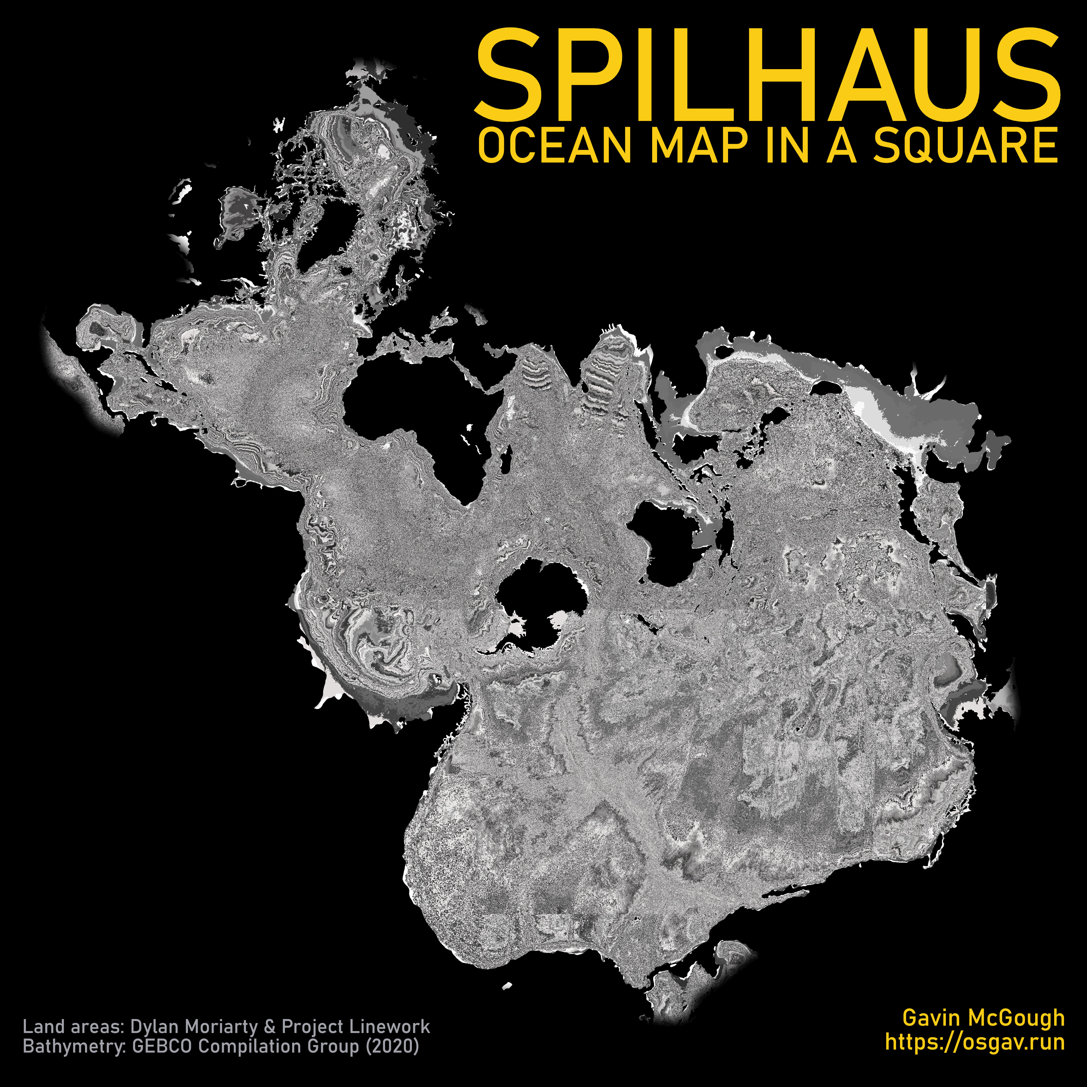
As part of the Esri Cartography MOOC I’m doing just now, I made this Spilhaus World Ocean Map in one of the exercises.
The bathymetry layer looks somewhat like TV static because instead of choosing a more typical colour ramp (say, lighter blue to darker blue) I picked one that was a selection of greys, that aren’t even in order. In this instance that colour ramp produced this effect, which I rather like.
With my title added I think it looks kinda like an album cover ha!
Here are some links to a whole lot more Spilhaus:
