- blog/
critical cartographer: 1
The first Student Reflection in GEOG 486 Lesson 1 asks:
Which map of the two below best communicates the trend of the data? Why?
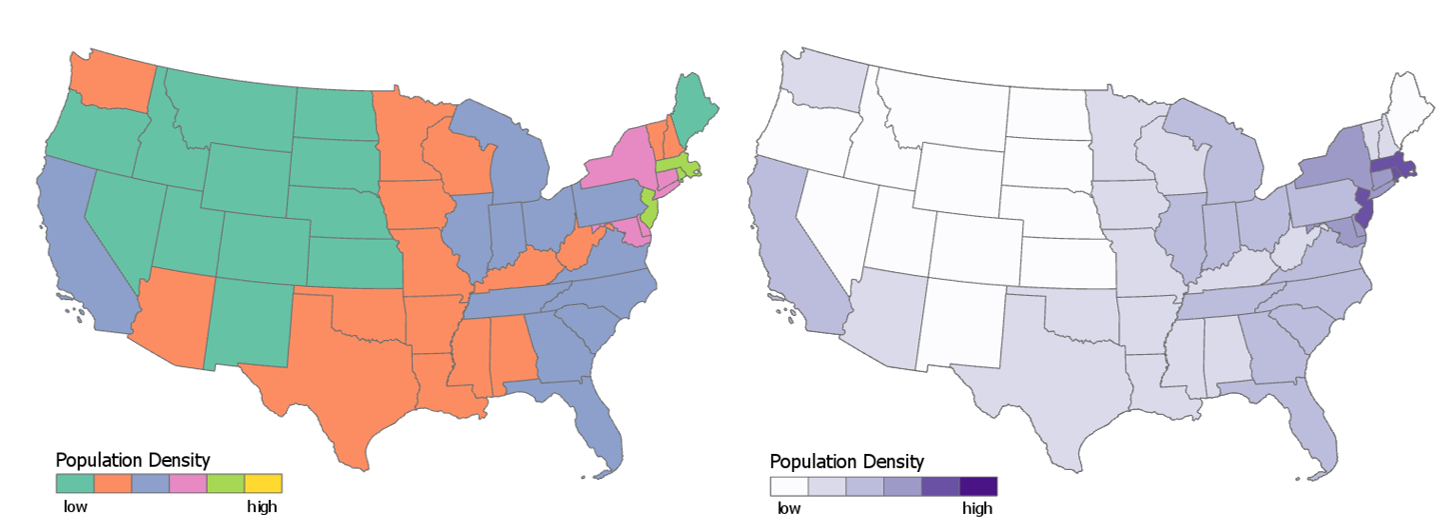
Credit: Cary Anderson, Penn State University, Data Source: US Census, American Community Survey.
My answer:
The right-hand map with the different hues of purple does a better job of communicating the trend of the data.
This is because there is an obvious relation between the changing colours and a changing scale of numbers. Light to dark, low to high. Perhaps it could be high to low, the direction isn’t necessarily a given (if there was no legend to indicate), but dark tends to mean more. Like more ink on the page to represent more occurrences / instances leads to a darker colour.
The left-hand map has a random selection of colours, and there is nothing intuitive about whether green should represent a higher or lower number than purple or orange.